Monday 27 June 2016

YCN Feel Good Evaluation


YCN Feel Good Evaluation

In this project I did an YCN brief. The brief was to re advertise the Feel Good brand to an audience of 18 -35. To start the project I had to look into the brand, it's advising and it's competitors. I had to compile this information into a powerpoint. After that I began looking at other ads I found and reviewed them. I mostly looked into drink ads as that is what I had to advise. I picked a few ads and started to analysis them. I did the same thing for Feel Good and looked at why they might not be successful. After that I went to design intellect to look at what the 50 best agency's had done.
After researching the company and it's competitors, I needed to do some primary research so I decided to go to the Museum of Brands. It was very helpful to my research as it has showed me how advertising has evolved. Then I went to the library and found a book called 'Advertising by design”. With the help of the book I made several mind-maps about different advertising approaches.

Then I decided to look up positive quotes as the company's message was about spreading positivity and I wanted to try and use that in an idea.

To get a better idea of what 18 – 35's did I decided to create a survey. I made it short as people don't really like answering long surveys. I got 25 people to do it and I asked a mix of ages to get varied results.

I then moved on to ideas. At first I went down the fruit route by only using fruit in my ad. I came up with mostly posters and billboards. I had to change my thinking as those ideas didn't really capture the brief. Further down the project, after a bit more research, I came up with more ideas trying to incorporate humour in to them. These ideas ended up being too childish for the age range. In my next ideas I tried to incorporate women and fruit together, as well as some humour. In the ideas I drew women doing various activities like sport, hanging with friends and just relaxing. After that I decided to take a different approach. I thought about making a poster for people feeling down. They could flip a flap and under neath would be a positive quote to brighten their day. I scarped the idea though because it still wasn't really targeted at the 18 – 35 age range.

I went back to the idea of women by using female athletes. I looked at pictures of athletes and tried to draw them. I scraped this idea too because using athletes would make people think of a sports drink and Feel Good isn't one.

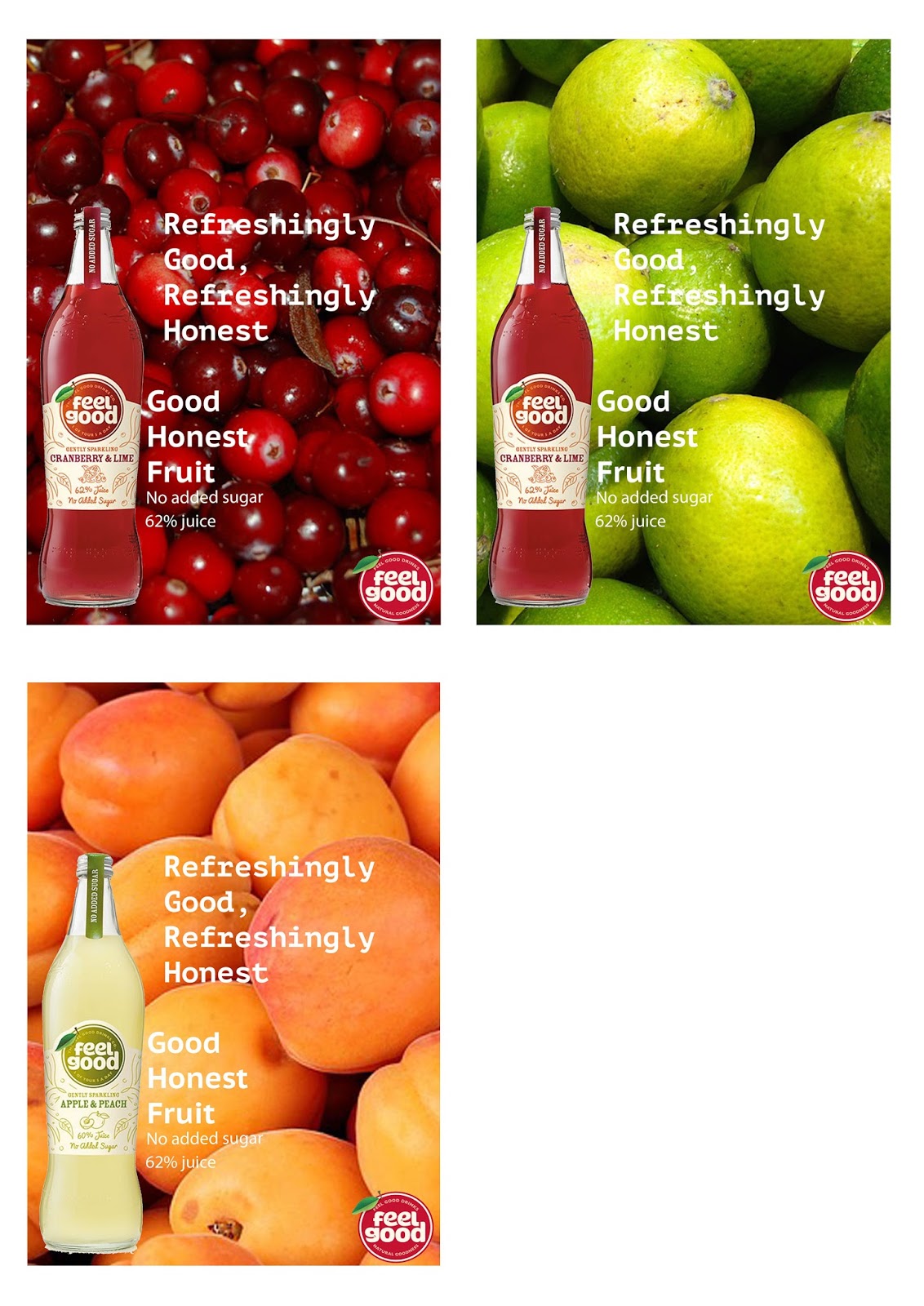
I still went with the women theme though and looked for various pictures of women. I found many images and decided to try them out. Most of the pictures didn't work but I used the ones I liked. After getting the pictures, I needed to figure out what type I wanted. So I experimented with a few and decided to use 'Lubaline Graph Bold”. I thought the font matched the theme better than most of the fonts I looked at. After choosing the font and placing the elements into the poster I felt it was a little empty so I used the ellipse tool. It helped it a little but it was a little bright so I decided to reduce the opacity to 60%. I then moved the text into the bubble as it was hard to see because of the background. I had to keep the elements consistent so I did the same to the rest of the posters.

If I had more time I would have done more than just posters. I would have more billboards and maybe a social media campaign. 

Poster Mockups

Poster Mockups

These are the mock ups of my final designs. I found a mock up template from the internet and then distorted the posters to make them fit in the space.It was a bit harder finding a landscape poster mock up so I had to go with more of a display one.


YCN Feel Good Drinks Diary

YCN Feel Good Drinks Diary

Jan 2016

For this project we had to chose a brief from the YCN website. I found it a little hard to decide on a brief. There were 2 I found interesting the designers bottle brief and the feel good drinks one. I eventually decided on the feel good drinks brief. I picked this brief because of the target audience, the positive message and the open brief.

The first task was to create a PowerPoint about the company. First I had to download the info pack from the YCN website. It was quite useful as it had most the info in one place. After I picked things out of the pack I went looking for any stats I could find on the subject. Finding them was a bit annoying but eventually I managed to find some. After that I thought it would be good to find some of the rivals stats and find out the difference.

22rd Feb 2016

I continued working on my PowerPoint. I decided to explore their website a little more. I found it very easy to use and reflect the positive image they want to convey, although it looks really childish, it reminds me of a pop up book. I also found out that the company used their blog to promote competitions, a little thing called “feel good Friday” and also they post pictures of people enjoying their products.

After I found out the information about the company I started to look to various ads and paste them in the PowerPoint as well as mood boards. I didn’t just look at feel good and drink ads; I looked at clever, simple and strange adverts. I also went looking for some inspiration. I found various fruits and layouts of other drinks advising.  I began making thumbnails of things that came to my head.

29th Feb 2016

This week we had to present out PowerPoint’s. On the Monday I added, why I chose the brief and a few thumbnails I liked. After that I continued to think of ideas for posters. I thought maybe I could try and create an animation out the poster idea I already had.

On the Thursday, we began to look at invoices and what we thought the pay and hours would be for graphic designers. We were then asked to create a plan for the next 8 weeks, saying what exhibitions we were going to, when we are doing ideas, development, mocks ups, prototypes – as well as secondary and primany research.

14th March 16

I went to the brand museum. It was very informative as it showed me how much adverting and packeting has changed. It was a small show but I really enjoyed the experience. I went there because I thought it would help me with my ideas and by seeing the show I was inspired to do so. Although it was quite pricey for such a small exhibition. I wasn’t able to take pictures so I couldn’t do much about that.


21st March 16

I continued to do some research. I decided to analysis some adverts to see what makes a good ad. I analyzed how successful it was, what I liked about it and the meaning behind it. I tried to pick different advertising approaches to get an idea for what attracts people.

29th March 16

I decided to get a book from the library to help me with my research. I found a page with different types of media and wrote them all down in a spider diagram. Then I created a diagram with different ways of advising to help me make something creative and attractive.

11th April 16

This week we had a review to make sure we are on the right track. I need to change my approach so I can create something effective for the age range. I began looking at the website “design intellect”. I looked at the 50th most successful ad agencies to get a better idea for what kind of ads is successful. I learned the majority of the ad campaign went with a few different approached, like Lucozade used a billboard, poster and a TV ad. Their approached were very bright and simple so they were memorable.

18th April 16

This week I continued with the ideas. I tried to come up with more humorous ideas as they capture audience’s attention more. I feel this would work well as funny adverts are memorable and stick in your head. I will do this by creating humorous images on a series of posters or a animation. 


25th April 16

I continued to brainstorm ideas. I went away from the humour ads as I wasn't really coming up with any good ideas.So next I tried to combine sport/ activities and fruit together. I did this because I wanted to incorporate fruit and activities that young women enjoy. Most of the ideas don’t look like they are promoting a healthy drink and look childish.


Then I thought about combining music and the product to do a social media campaign. The idea was to use social media (Twitter, Instagram and maybe Facebook) to get people to post their "Feel Good Playlists". They would then tag it as #FeelTheBeat. I dropped this idea as I didn’t think it would promote what I needed.

2rd May 16

I then decided to go for a more photographic approach. I went on to Pixabay and found some images of fruit I could use in the background. I did this with several of the flavours. I scraped this idea as well as it looked plain and boring.

After that I went with a different set of posters. The idea was to use the outline of the bottle to create a simple and minimalistic approach. I was inspired by coca cola as they do very similar campaigns. I was also going to use the images in a simple animation to go with the posters. I ended up going away from this idea as my friend pointed out that no one would know what the drink looked like as well as it not meeting the brief.

9th May 16

I went back to photography. I tried to find images of woman having fun. The first poster I did have a women jumping by a beach. The slogan with “The feel good feeling”.  The slogan wasn’t that creative as I was going to change it. I tried to find a font that captured the product. I went with a serif font which looked a bit too plain.  


23rd May 16

I started doing a survey. I did this to find out what women of 18 – 35 think and like. So far I have found out the most women have never heard of Feel Good Drinks. Most people had different ideas about what they liked about adverting. I will continue to ask people. I need to ask more older people as I have only asked women between “18 – 25”.


I continued with the idea from before but changed a few things. One of the things was the slogan, which I changed to “Feel Good About Your Lifestyle”. I think this captures the brief more than the first slogan as it is aimed as normal people who want a healthy lifestyle as well as the sweeter stuff.


6th June 16

I started doing the final touches to 2 of final posters. I changed the type as it didn't match the poster so I used the font "Lubalin Graph Bold". I also added some circles using the ellipse tool. I think this helped to make the poster stand out more. Although my tutor told me to put an opacity on it. So I put it to 60% and I really liked the way it looked after that.

Later that week I had to create some more posters but this time I had to find pictures of women doing jobs like mother, teacher, doctor etc. With the images I found I began to put them in to Photoshop. I experimented with portrait and landscape posters. Some of the posters looked better than others.

20th June 16

I finally finished my posters. I ended up using 4 posters. I quite like how they turned out in the end. I spend the rest of the week finishing my project work.


Sunday 26 June 2016

Woman Pictures for posters

Woman Pictures for posters

These are the images I found to use in my posters. They are all royalty free. I tried to find images of woman having fun and smiling as that is what Feel Good wants to convice. I also tried to find women doing jobs like parent, vet, teacher etc. I did this because I wanted to show “normal” working women on the poster. Some of the images do look a bit cliché and not natural so I might not use all of them.


Digital ideas - Fruit ideas

Digital ideas - Fruit ideas

With these ideas I decided to use a simple approach. I found some royally free images of fruit to use.

I scraped this idea because I thought it didn't look special and looked pretty boring. In some of the posters the bottles get a little lost and the type is hard to read.


Feel Good Slogen Type

Feel Good Slogen Type

I didn't know what type to pick for my posters so I decided to experiment with a couple to see what would work best. I think the bolder fonts worked better than the lighter fonts as the brand needs bigger font to stand out. I felt like lower case and upper case letters would work better than just upper case as it would seem to shouty. In the end I went with Lubalin Graph Bold as it fit the image I wanted to get out.


Digital Ideas